Reference Photos
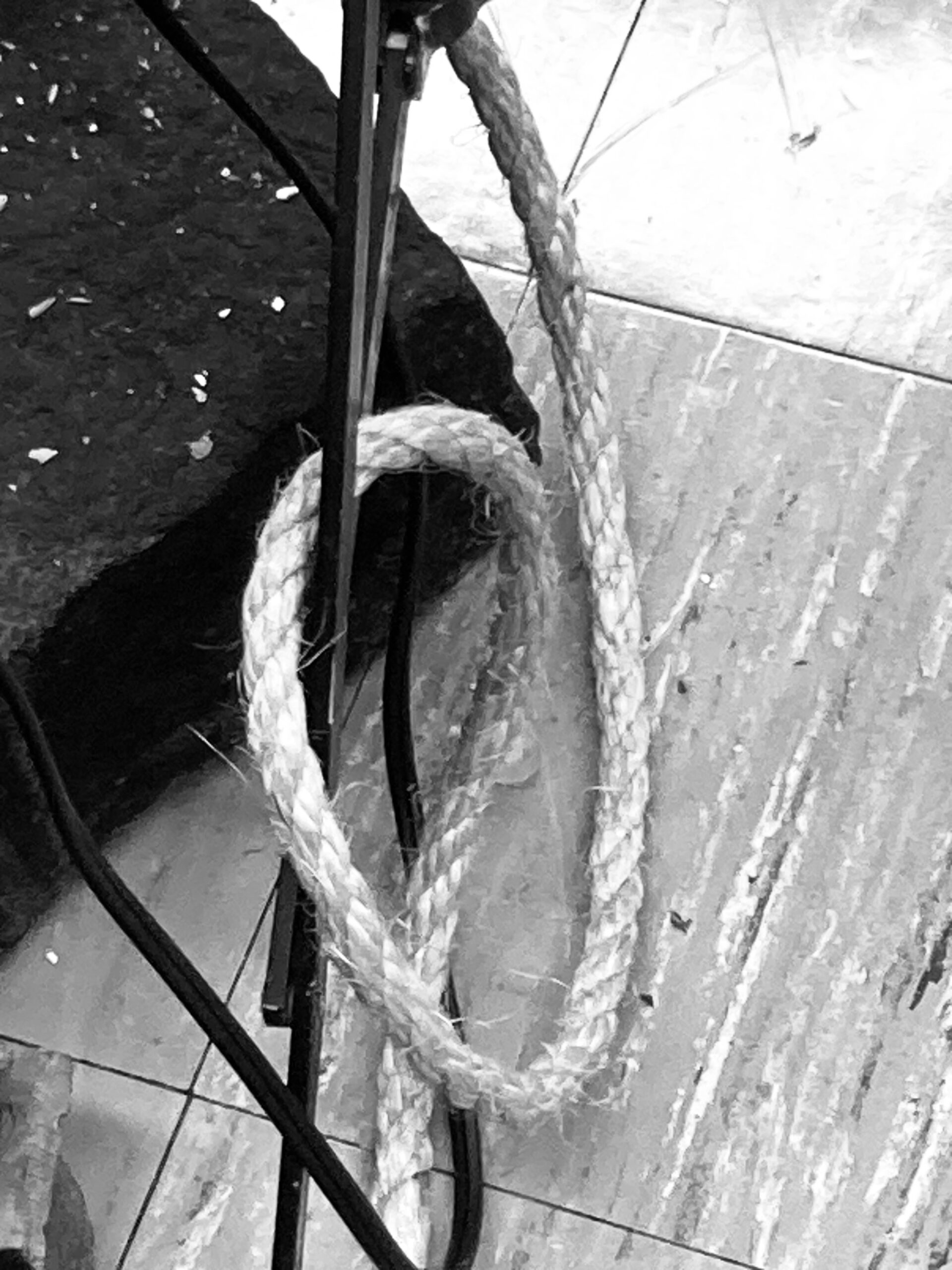
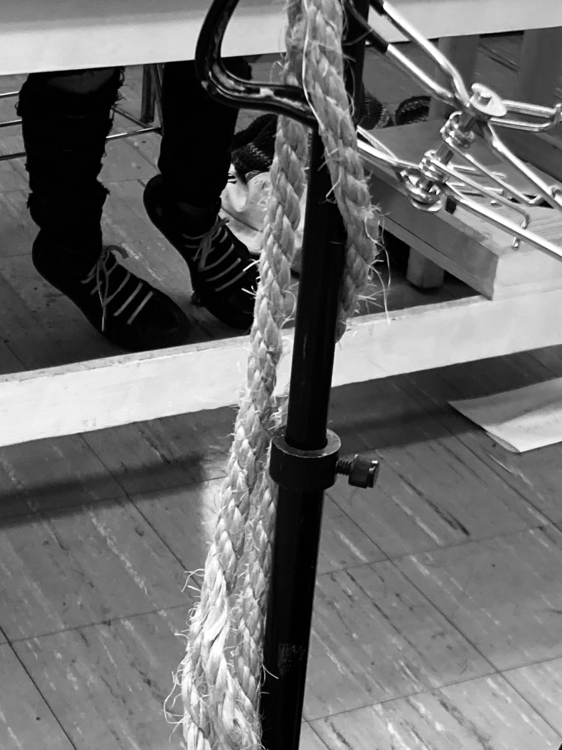
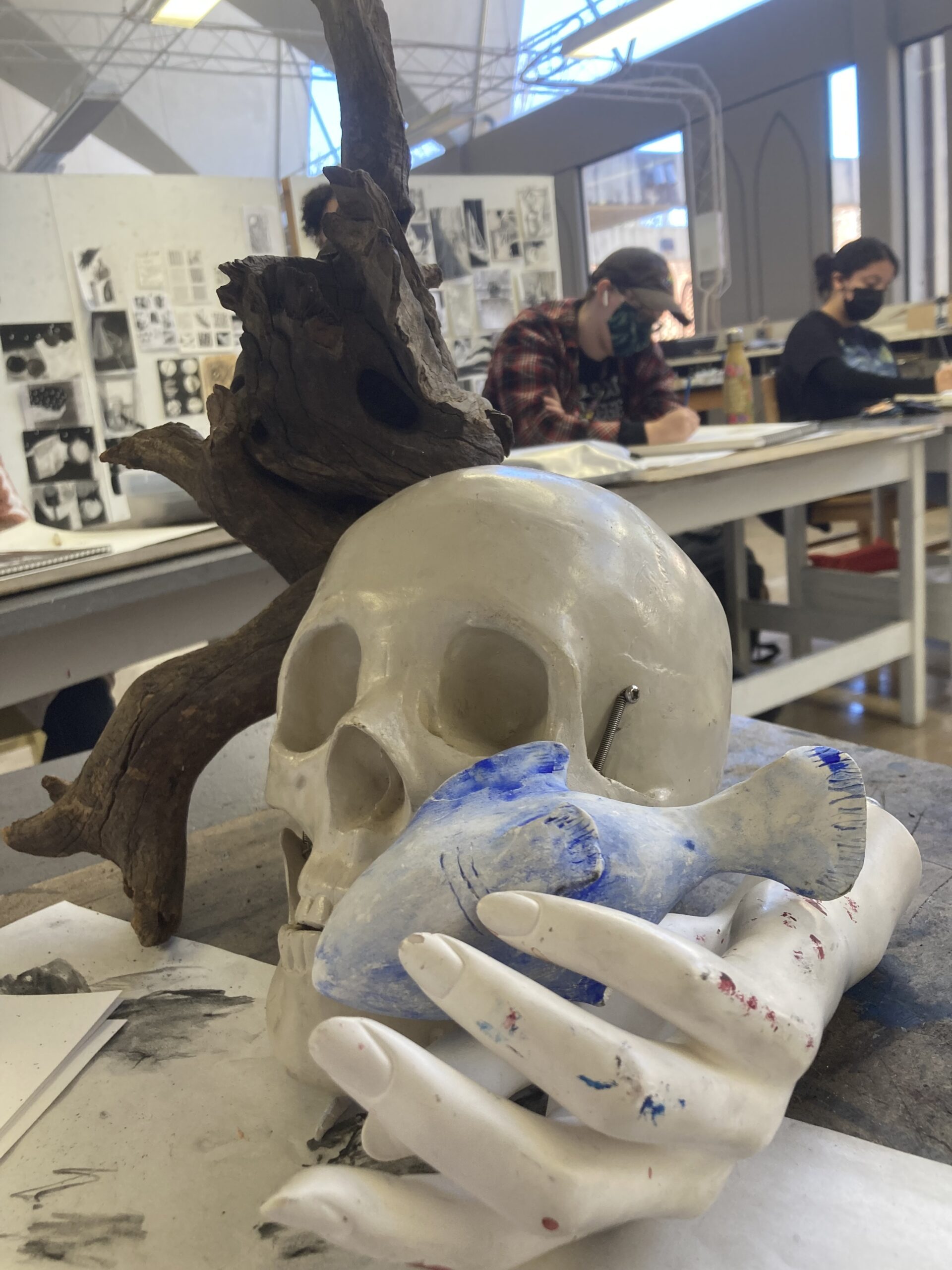
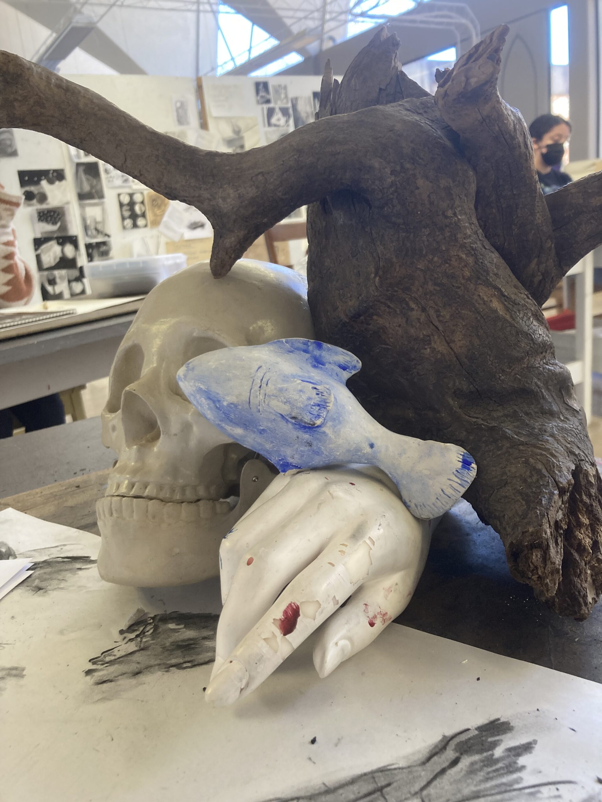
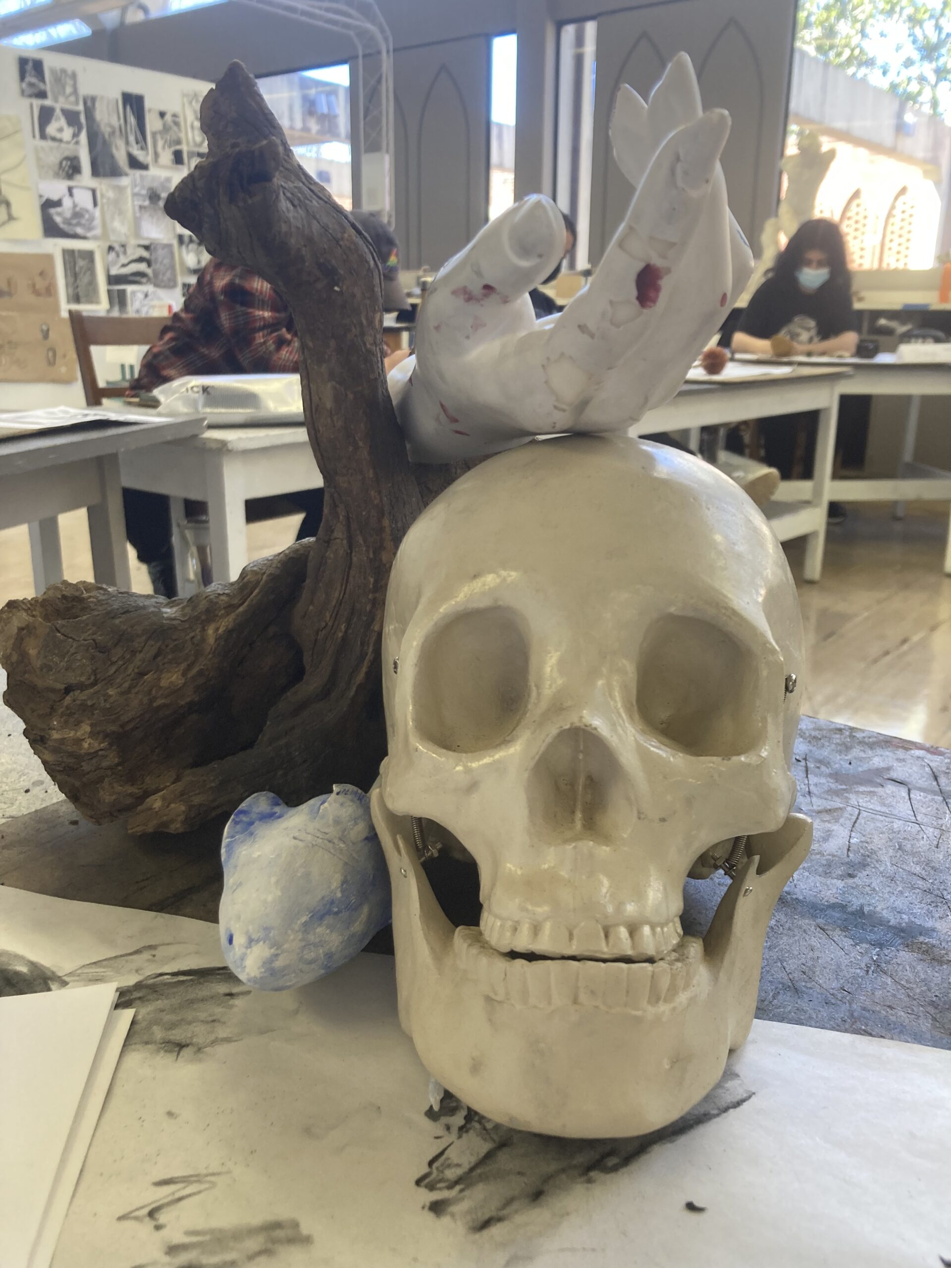
The objects that I initially chose for my mid-term were everything but the rope. I wanted to incorporate the skull again from my 4-drawing assignment because of its reflectiveness. I am very comfortable drawing skulls and hands so I knew I would be able to execute those two objects at least semi-decently. I wanted to challenge myself a bit with choosing the bark, I have never attempted to draw bark or emulate it in any way other than for this assignment. I chose the fish because I love marine animals, I liked the smooth yet chalky/clay feel of the fish that I wanted to try and replicate that in the drawing. The rope, lastly, was an after-the-fact addition to my composition. I had sketched everything out on the page when I noticed that there was a lot of white space that I felt needed covering. I added in the rope because of the texture and the way I could make it flow in my composition.
Thumbnails
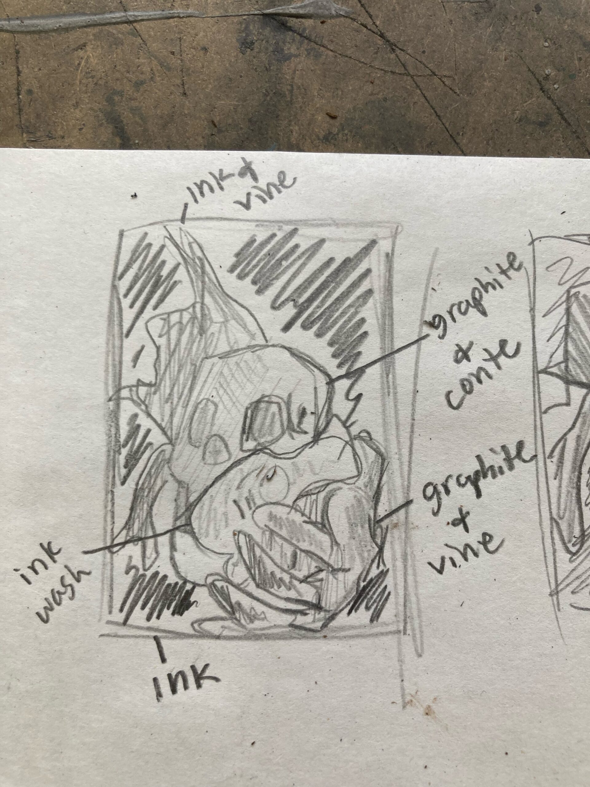
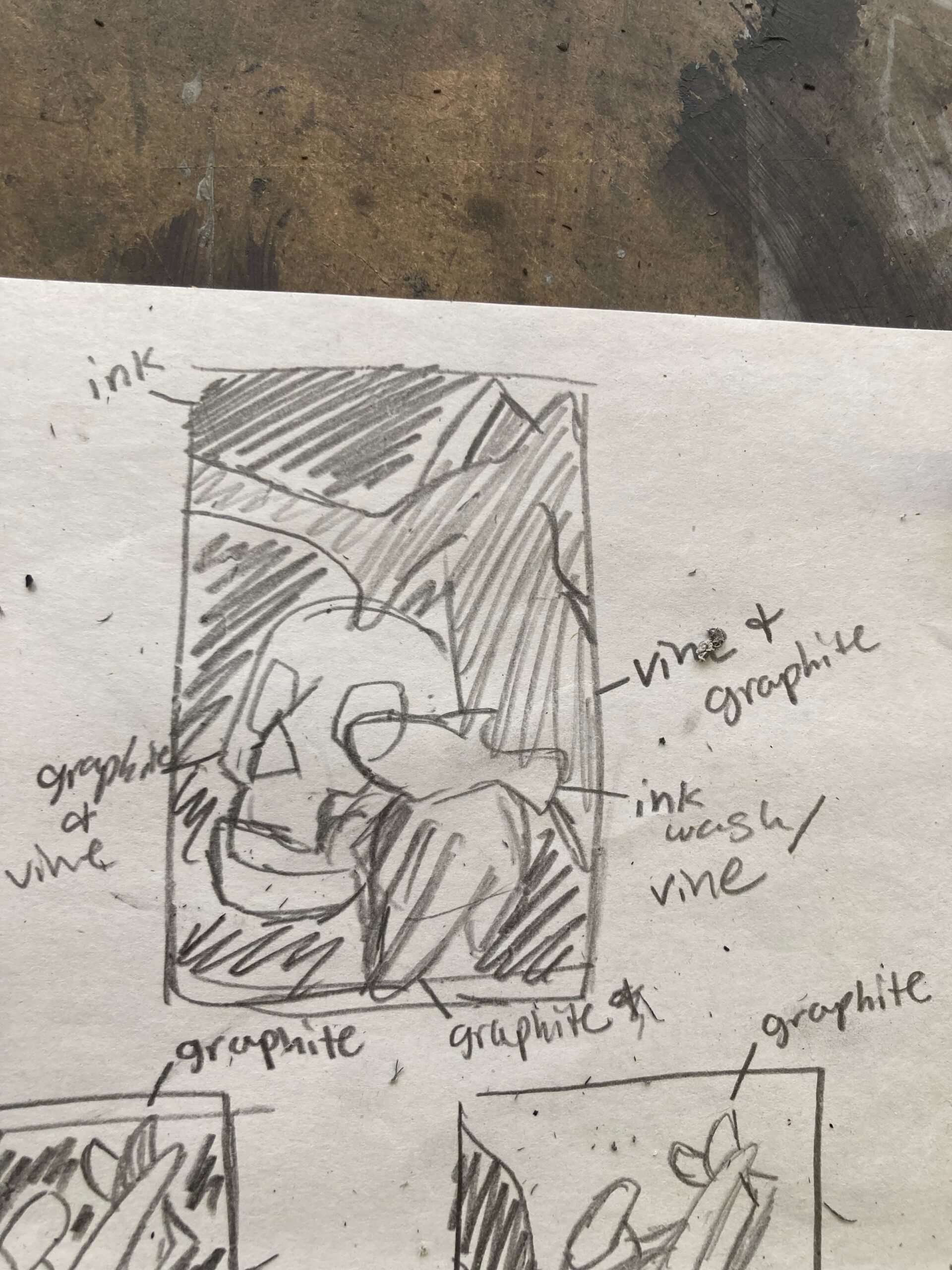
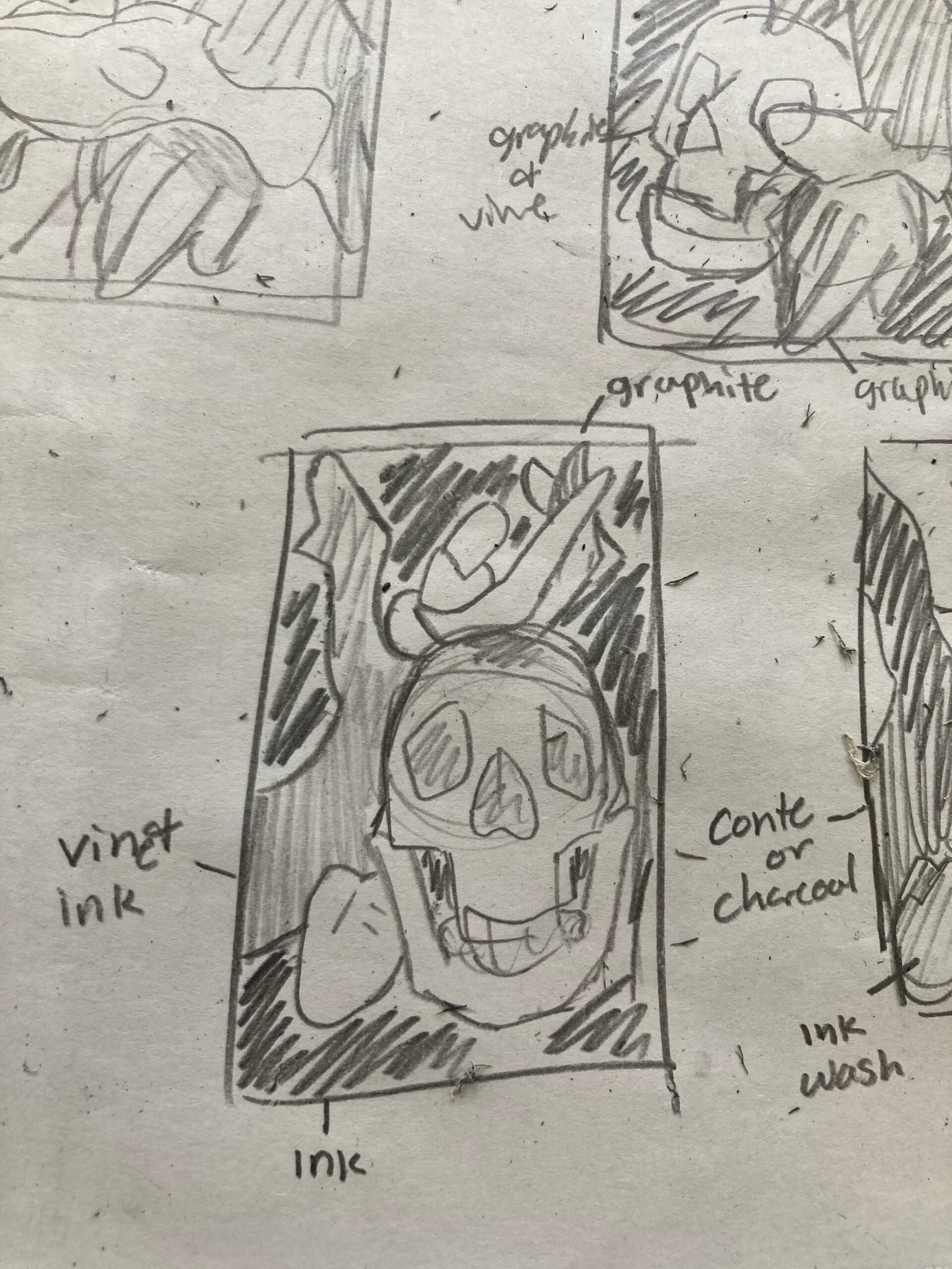
I did about 6 thumbnails for this mid-term but I can only seem to find 3 images of the thumbnails I submitted for grading. Each thumbnail is an attempt to figure out the spacing on a page and finalize which composition I wanted to do. The materials I did end up choosing for this piece were India Ink, graphite stick, Mars Lumograph, a few sketching pencils, brown paper, a sanguine crayon, and a conte stick. I ended up not using the vine charcoal, charcoal pencil, ebony, and charcoal sticks because I felt they would be too heavy-handed in value on the specific objects. The Ebony pencil, at least leaves, streaks of metallic reflections if rubbed too hard which I didn’t want.
Final Drawing
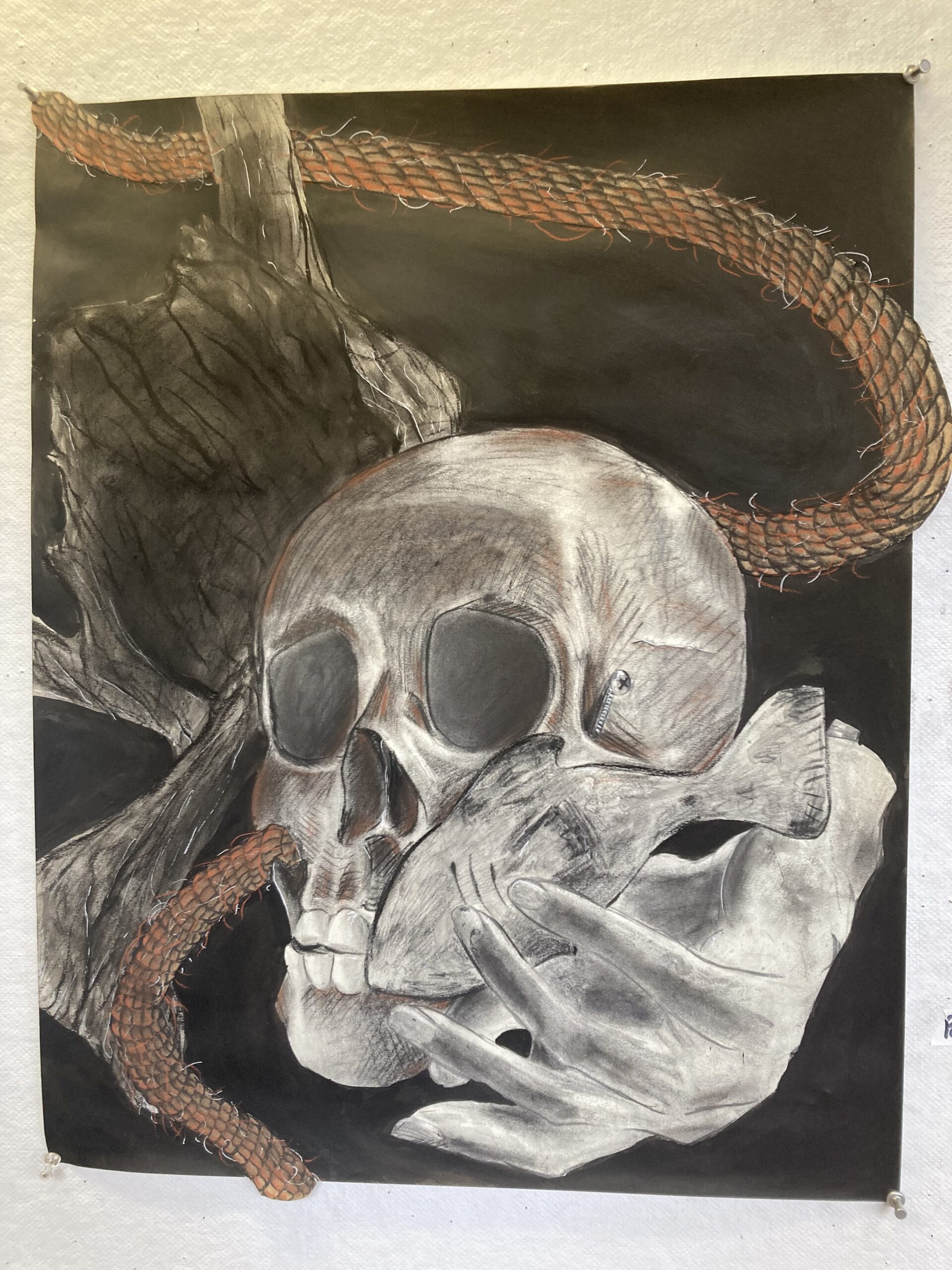
At first, I didn’t have a plan for which I wanted to follow exactly. I had spent a couple of days just testing out different materials to get more comfortable with them before actually putting them on my drawing. When sketching this out I make sure to try sketching with my shoulder instead of with my wrist. Since this was a large piece, I wanted to try my hand at different drawing techniques. I also kept moving around the piece to look at it from different angles so I can get my mind going with how I would go about using the materials. I first sketched out the objects on paper and when I noticed that there was more white space than I wanted, that is when I added the rope in the back to draw the eye and cast it down the drawing. I started off trying to cover big sections, I took the graphite and covered the hand and fish. I used a watered-down India ink and covered the bark. I glued down the brown paper in the shape of the rope and used the mars lumograph to outline the rope’s pattern. I used my blending stump to blend it out and took a white gel pen and the sanguine to make the highlights and frayed wisps in the rope. I used the India ink and conte on the bark to emulate what the bark looked like. I didn’t blend anything out on the bark but kept layering on the washed-out India ink to build up the values. I mainly used the graphite stick on the hand, I wanted this object to be softer than the rest of the other objects. I did this by trying not to use many harsh and sharp lines. The fish was a bit of a surprise to me on how it would turn out. I used the conte and India ink to try and make it look clay-like. Upon layering on the ink, I ended up ripping the paper near the fin of the fish. I wasn’t worried when this happened, I actually thought it added another layer of texture that I could work with. Lastly, with the skull, I used graphite, conte, and the sanguine crayon. I started off using sharp lines on the edges of the skull and in the more prominent areas of the skull. I kept erasing areas to show highlights and adding on darker materials to make the contrast even more visible.
One aspect I liked about the drawing is the use of the orange sanguine crayon. I liked how it made the drawing pop in a sense. When I added it to the skull, I felt I really brought the entire drawing together. Things I didn’t like about my drawing are the bark and parts of the actual rope. I feel I didn’t put enough effort into those sections and that I could’ve spent a lot more time on those, and some more planning as to how I would execute those areas to how I wanted to. I felt like for this assignment, just like my 4-drawing assignment, I didn’t put any detail into the background. These are just floating objects that are arranged into a specific composition. I feel like I am not comfortable making any backgrounds, it is easier for me to focus on the objects themselves. For future assignments, I hope to do more in the background of the objects than just leaving them a solid color.
