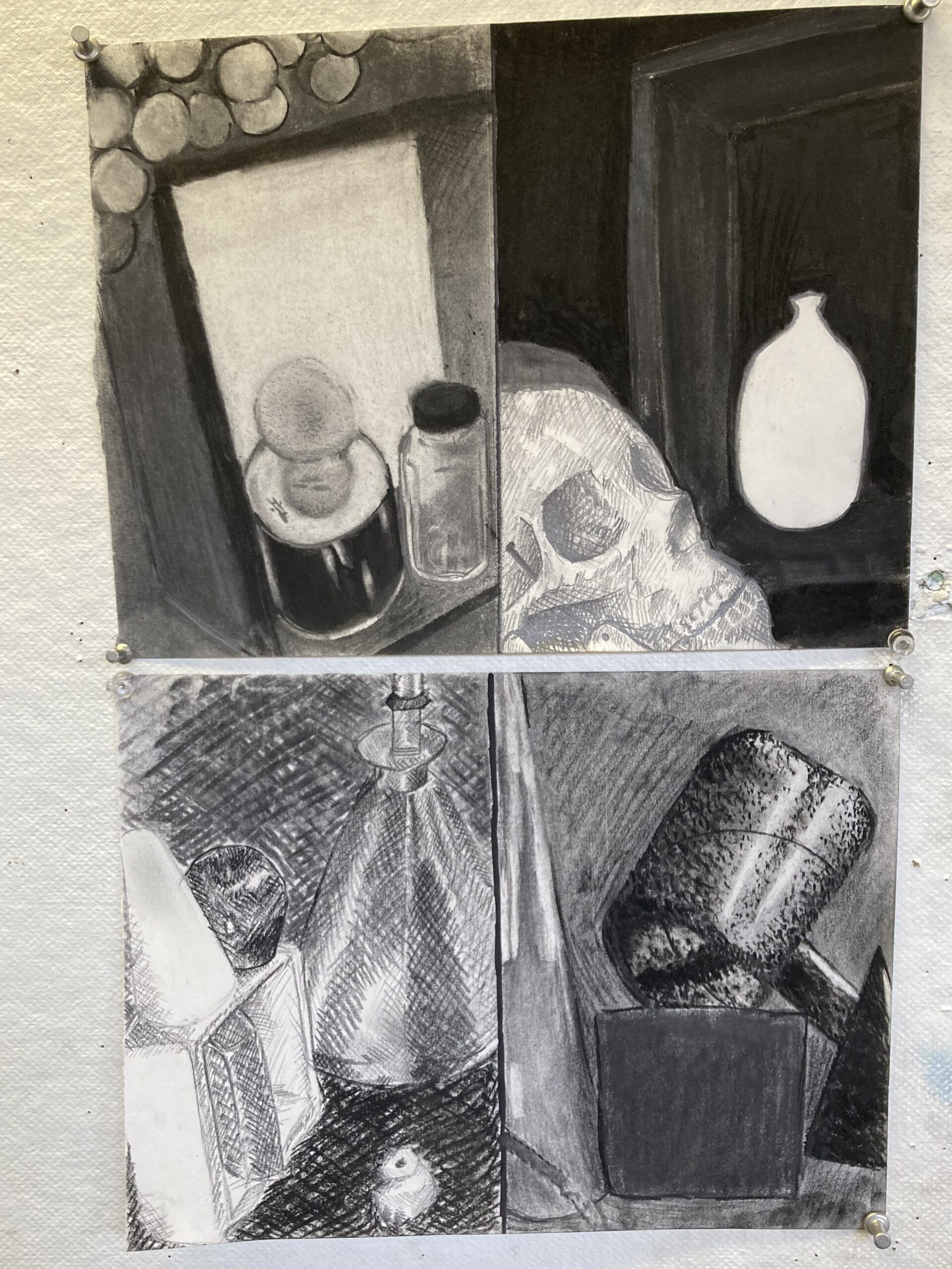
My 4 drawings for Art 160
Bottom: left is my 1st drawing and the right is my 2nd drawing
Top: left is my 3rd drawing and the right is my 4th drawing
Process: My first thought when touching upon this assignment was that I wanted to do well but also wanted to try different techniques with the materials I was provided. This assignment was similar to the other art classes I had taken in school, I heard a lot of these technical terms like cross-hatching, hatching, stippling, contouring, blending, shading, etc. I started my first drawing by making what I was comfortable with, cross-hatching. The thumbnails I did for this composition were stuck between a horizontal and vertical composition. With help from my professor, I ended up choosing a vertical composition for all of my drawings. My second drawing wasn’t the best and after a while of fiddling with materials, composition, and the possibility of starting over, I had to move on from it because it wasn’t sparking anything in me. I didn’t like it and the best thing I could’ve done was to move on and start another with fresh eyes. My third drawing was my favorite, the perspective I chose was more of a top-down view from an angle. I left little detail in the grapes and added more in the 3 objects towards the bottom. I tried making the box a line for the eyes to follow when looking at my main focal point for that drawing. My fourth drawing was also a favorite of mine. I liked how I left the vase in the back in a positive light and my cross-hatching on the skull. I would’ve liked to have improved the darker values within the piece itself. The box is almost muddled into the background, I could’ve taken my graphite stick and ebony to have made it stand out but other than that I was content with the outcome of the drawing. I enjoyed making all of these drawings, even if I wasn’t satisfied with the end result of them, and I loved the process of seeing the pieces all come together towards the end of it.
Materials: The materials I used were, a vinyl eraser, gum eraser, kneaded eraser, blending stump, ebony pencil, a couple of graphite pencils (sketching), mars pencil, charcoal pencil, graphite stick, compressed charcoal, conte stick, and vine charcoal. I liked using the compressed charcoal the most. It was a very smooth application when it made contact with the paper and even when adding more pressure to the drawing, the dark values were very clean. I used that primarily when adding a darker background or to really dark parts on the objects. I didn’t favor using the charcoal pencil and graphite stick mainly because of the application it has on paper. It was hard to smooth out the lines with a blending stump and the values weren’t my favorite out of all the materials I used.
My favorite: My favorite drawing I have up here is my 3rd drawing. The overall composition and perspective of the objects were a lot more interesting than my other drawings. I liked that the focus of my drawing was put on the objects rather than anything in the background. I put a lot of detail in the can and the glass bottle because I wanted that to be my main focal point. For the bottle, I did a subtractive method using the gum eraser, ebony pencil, and mars pencil. The cap of that bottle was made with compressed charcoal and charcoal pencil. I used my graphite stick when sketching the overall composition of the drawing, vine charcoal in the background, and the Conte stick in the border of the box. I enjoyed making this drawing over the others because I felt I put a lot more time and thought into this one than my other three.
My least favorite: I didn’t necessarily like my 2nd drawing out of the 4 I have up there. The values are the dark and light feel muddied, I tried a stippling technique on the hammer-shaped object that didn’t turn out well, and the vine charcoal in the back kept smudging while I worked which was a tad annoying. The composition of the drawing felt very linear, I wasn’t successful in executing the depth that I wanted in the drawing that I had originally seen in the photo I took. I feel like I could’ve turned the drawing into a positive-negative design, which probably would’ve helped the shapes stand out without muddying the overall image. I also think that if I changed the composition of the drawing or taken a better photo I could’ve done better with the object I chose to draw.
Closing: Overall I enjoyed this assignment, and I look forward to diving more into these techniques. I hope next time I will be able to do a blind contour or a positive-negative drawing. I struggle a lot with proportions so hopefully, I will be able to work on that in future assignments.
